Appearance and language
You can adjust how the SlideMind widget looks and which language its texts use. Workspace owners set defaults for every slide; authors can then change a single slide. This page covers both levels, the Chat labels, and how the settings combine.
These settings apply to every SlideMind widget destination: HTML Widget (iframe), Articulate Rise 360 (Code block) and Articulate Storyline (Web Object). They have no effect on slides that use the Authoring tool interface.
How the settings combine
Section titled “How the settings combine”Each setting is resolved on its own, from the most specific level to the most general:
- The widget URL: appearance parameters you add by hand to an HTML widget URL (see the advanced section).
- The slide: the Look step of the slide editor.
- The workspace: Settings › Integrations › HTML Widget defaults.
- The product defaults: the values SlideMind uses when nothing else is set.
For example, if the workspace uses a dark theme and a slide changes only the primary color, that slide keeps the dark theme and uses its own color.
You do not need to reinstall the integration code after a change: the widget reads its appearance each time it loads. See Changing a slide after installation.
Set the workspace defaults
Section titled “Set the workspace defaults”Only the workspace Owner can change these defaults. Editors see them in read-only mode.
- Open Settings › Integrations.
- In the HTML Widget defaults section, change the fields you need.
- Select Save settings.
Despite its name, this section applies to all three widget destinations, not only the HTML widget.
| Field | What it does | Product default |
|---|---|---|
| Theme | Light or Dark. The inherited assistant colors follow the theme. | Light |
| Learner language | English or Français. The language of the buttons, labels and messages the learner reads in the widget. | English |
| Primary color | Used for the header, the learner’s bubbles and the send button. | #4f46e5 |
| Assistant bubble color | Background of the AI replies, and of the feedback box in the Question header and Worksheet layouts. | Follows the theme: #f1f5f9 (light), #1e293b (dark) |
| Assistant text color | Text of the AI replies. | Follows the theme: #1e293b (light), #e2e8f0 (dark) |
| Bubble radius | Roundness of the bubbles, from 0 to 24 pixels. | 12 |
| Show header | Shows or hides the colored header band. In a Chat, when the header is hidden, the restart button moves beside the message box. | On |
| Widget title | Title shown in the header. Leave it empty to use each slide’s title. | The slide title |
Colors use the six-digit hexadecimal format, such as #4f46e5. Next to each changed field, Use inherited returns it to the inherited value.
Under the fields, two contrast checks compare your colors with the WCAG 4.5:1 ratio: White text on primary color and Assistant text on bubble. A color below the ratio shows a warning, but you can still save it.
Restore the product defaults
Section titled “Restore the product defaults”To remove every workspace override at once, select Restore product defaults, then Restore defaults in the confirmation dialog. Slide settings are not affected, and widget URLs that already carry appearance parameters do not change.
Customize one slide
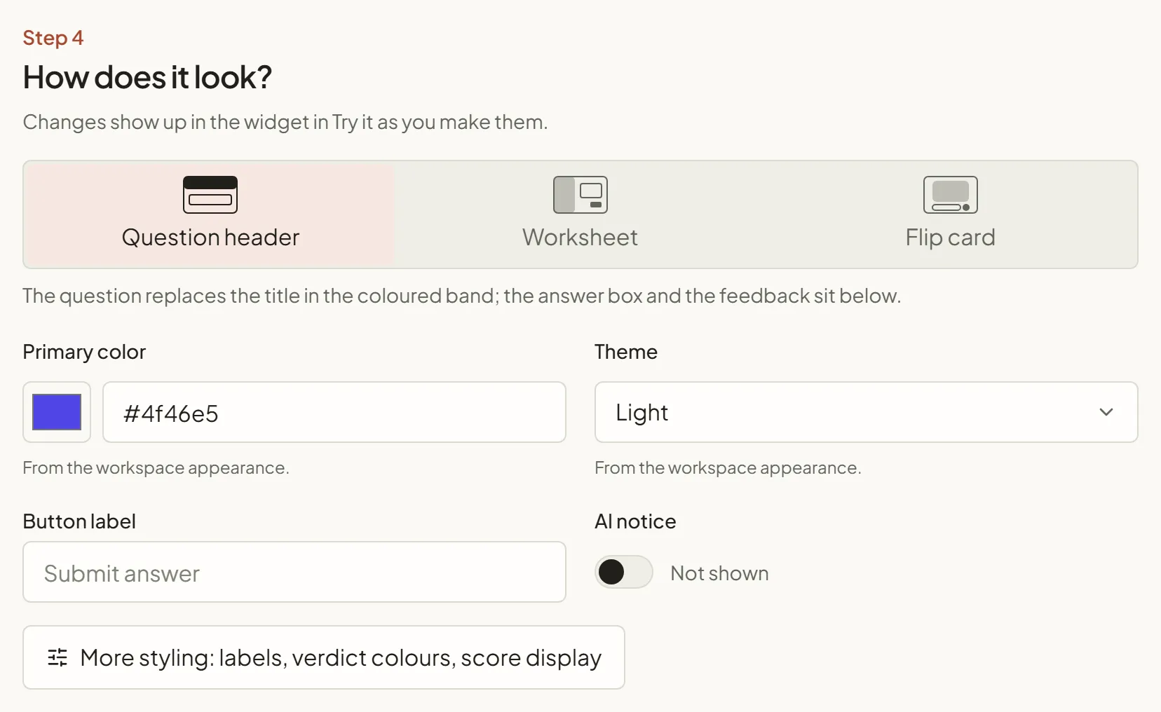
Section titled “Customize one slide”Slides whose interface is SlideMind widget have a Look step in the slide editor. Changes appear in the widget preview of Try it as you make them.
- Open the slide and go to the Look step.
- Change the main settings shown in the step:
- Primary color and Theme. A hint under each field tells you where the value comes from: “From the workspace appearance.” or “This slide only.”
- For a Q&A slide, the layout (see Q&A layouts) and the Button label of the submit button.
- AI notice (see AI notice).
- For more settings, select More styling: labels, verdict colours, score display (Q&A slide) or More styling: labels (Chat slide). The Widget styling panel opens. In its General appearance section, you find the same fields as the workspace defaults, including Learner language.
- Save the slide.
In General appearance, Use workspace appearance removes the slide’s overrides of these fields, so the slide follows the workspace again. Labels, layout settings and the AI notice are not affected. Show header is offered for Chat slides and for the Question header layout only; the other Q&A layouts have no header band.
Learner language
Section titled “Learner language”The Learner language sets every default text the learner reads in the widget:
- the Q&A labels of each layout;
- the Chat labels and the end card;
- the error messages;
- the default texts of the AI notice.
A label you type yourself always wins, whatever the language. The page-level messages that replace the whole widget, such as “Configuration not found.”, always stay in English.
The Learner language does not decide the language of the AI. The AI answers in the language of your instructions. For a French course, write the instructions in French, or tell the AI explicitly which language to use. See Write the AI instructions.
Chat labels
Section titled “Chat labels”In a Chat slide, the Widget styling panel has a Labels section. Leave a field empty to keep the default of the learner language, shown as a placeholder.
| Field | English default |
|---|---|
| Empty conversation | Start the conversation |
| Message box | Your message… |
| Send button | Send |
| Restart button | Restart conversation |
| Message box after the last turn | Conversation ended |
| End card title | Activity complete |
| End card text | You can continue. |
When a conversation with a turn limit ends, the end card shows your closing message, or the End card text when there is none. Q&A labels are described in Q&A layouts.
Preview the widget
Section titled “Preview the widget”The Try it panel of the slide editor shows the widget with your current settings:
- Wide (720px) and Narrow (540px) change the preview width.
- Enlarge, the arrows icon next to them, opens a larger preview. Drag its corner, or enter a Width (px) and a Height (px), to match the space the widget gets in your course. This size is only a viewing aid: your authoring tool or web page decides the real size.
On the plans that show the “Powered by SlideMind.app” line, the preview shows it too. You can’t hide it in the appearance settings: see What learners see.
See Try it.
Advanced: appearance parameters in the widget URL
Section titled “Advanced: appearance parameters in the widget URL”The HTML widget’s integration code is an <iframe> whose address contains ?mode= followed by the slide’s activity type. You can add appearance parameters after it, each one preceded by &. They override the slide and workspace settings for this embed only.
| Parameter | Values | Example |
|---|---|---|
theme | light or dark | theme=dark |
color | Primary color, with # written as %23 | color=%23e11d48 |
ai_color | Assistant bubble color | ai_color=%23e2e8f0 |
ai_text_color | Assistant text color | ai_text_color=%23334155 |
radius | 0 to 24 | radius=8 |
header | 1 (show) or 0 (hide) | header=0 |
title | Header title | title=Role%20play |
An invalid value is ignored, and the next level applies. The Learner language cannot be set in the URL.
Prefer the slide and workspace settings when you can: they apply everywhere without editing the code. See HTML widget (iframe).