
Q&A layouts
A Q&A slide shown in the SlideMind widget uses one of three layouts. This page explains how to choose a layout and how to adjust its labels, colors, structure and structured results. It is for authors of Q&A slides whose interface is SlideMind widget.
Choose a layout
Section titled “Choose a layout”- Open the slide and go to the Look step.
- Select one of the three layouts at the top of the step. A short description appears under your choice.
- Save the slide.
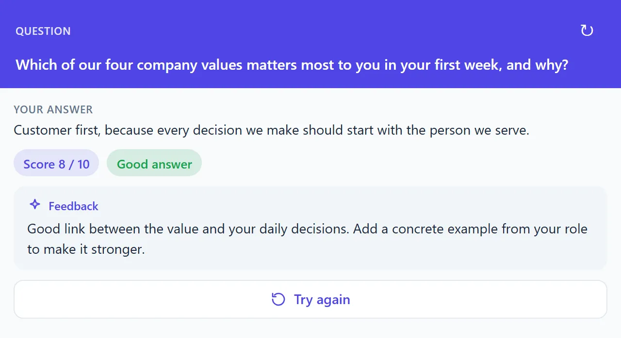
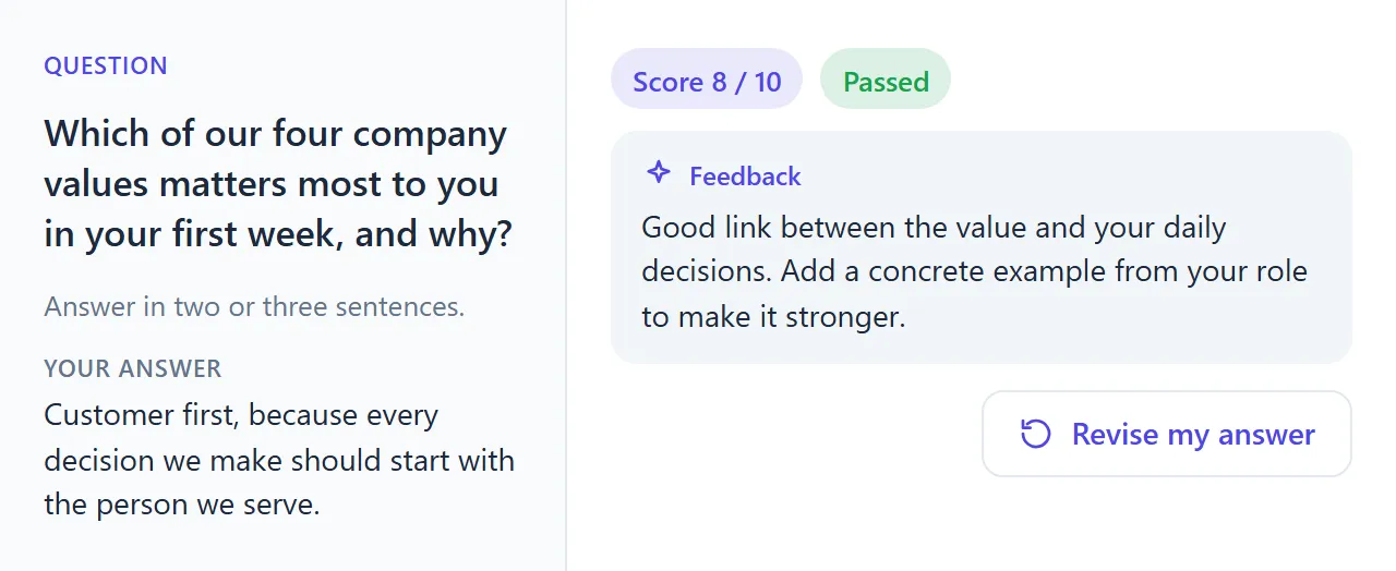
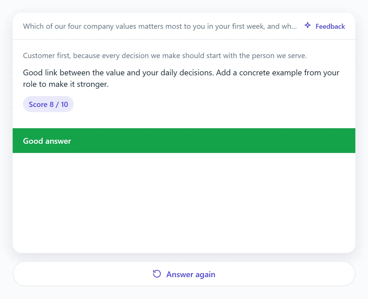
| Layout | What the learner sees | Use it for |
|---|---|---|
| Question header (default) | The question replaces the title in the colored band. The answer box and the feedback sit below. | Most questions, in a compact space. |
| Worksheet | The question on the left, the answer on the right, like an exercise sheet. The columns stack below 560 px wide. | Questions that need an instruction, in a wide space. |
| Flip card | One centered card: the question on the front, then the feedback and a colored verdict on the back. The card turns over when the learner sends the answer, and turns back with Answer again. | Short questions with a clear verdict. |
The layout only changes how things are arranged. The question, the AI instructions and the feedback stay the same. Every setting below is saved with the slide: there is no workspace default for layouts.
Open the layout settings
Section titled “Open the layout settings”In the Look step, select More styling: labels, verdict colours, score display. The Widget styling panel opens. After General appearance and the AI notice, it has four groups for the Q&A layout: Labels, Colours, Structure and Structured results.
The Look step itself also has a Button label field: it is the same setting as Submit button in Labels. In the Look step, this field accepts up to 60 characters.
Labels
Section titled “Labels”Each label has a default in the widget’s Learner language, shown as a placeholder. Leave a field empty to keep the default, or select Use default to clear a label you typed. A label can be up to 200 characters.
| Field | English default |
|---|---|
| Question label | Question |
| Answer label | Your answer |
| Answer placeholder | Write your answer here… (Flip card: Your answer…) |
| Submit button | Question header: Submit answer · Worksheet: Submit · Flip card: Send answer |
| Feedback label | Feedback |
| Retry button | Question header: Try again · Worksheet: Revise my answer · Flip card: Answer again |
| Score label | Score |
| Pass verdict | Good answer (Worksheet: Passed) |
| Partial verdict | Partially correct |
| Fail verdict | Not quite |
| Assessment unavailable | Assessment unavailable |
On the Flip card, the submit button is a round arrow: its label is read by screen readers and shown as a tooltip. Learners whose system asks for reduced motion see the back of the card at once, without the turning animation.
Colours
Section titled “Colours”Colors use the six-digit hexadecimal format, such as #16a34a. A color you set stays the same in the light and dark themes. Colors you leave inherited follow the theme.
| Field | Layouts | What it does |
|---|---|---|
| Question panel | Worksheet | Background of the question column. |
| Card background | Flip card | Background of the card, front and back. |
| Card shadow | Flip card | Lift of the card over the widget background: None, Soft (default) or Strong. |
| Pass colour, Partial colour, Fail colour | All | Color of the verdict badge, or of the verdict band on the flip card. |
On the Flip card, the verdict band uses white text. A note under the colors shows the contrast of white text on the pass color against the WCAG 4.5:1 threshold.
The primary color, the theme and the assistant colors come from General appearance: see Appearance and language.
Structure
Section titled “Structure”| Field | What it does |
|---|---|
| Allow another attempt | Shows a retry button after the feedback. On by default. |
| Instruction under the question | Worksheet only. A short instruction under the question, up to 500 characters. For example: “Answer in two or three sentences, in your own words.” |
| Score display | Fraction (8 / 10) (default), Bar and fraction, or Hidden. |
| Submit button position | Left, Right or Full width. Not offered for the Flip card. By default, Full width for Question header and Right for Worksheet. |
In the Question header layout, when Allow another attempt is on, the retry action also appears as a ↻ button in the colored band. If you hide the header (Show header in General appearance), the question appears in a box at the top of the widget instead.
Structured results
Section titled “Structured results”By default, the widget shows the AI’s reply as feedback. To also show a score or a verdict, the slide needs return variables:
- In the Results & memory step, select Score and verdict.
- Add return variables, for example a Number for the score, a Boolean for pass or fail, and a Text for the feedback. See Results: plain text or structured.
- In the Look step, select More styling: labels, verdict colours, score display, then map them in Structured results.
| Field | What it does | Example |
|---|---|---|
| Feedback text | The Text field shown as feedback. Automatic (first text field) uses the first text return variable. | feedback |
| Score | The Number field shown as the score, or None. | score |
| Score out of | The maximum score, a whole number from 1 to 1000. Shown once a score is mapped. Default: 10. | 100 |
| Pass / fail | The Boolean field that decides the verdict, or None. | passed |
| Pass from | Score from which the verdict is “pass”. | 70 |
| Partially correct from | Score from which the verdict is “partial”. | 50 |
Pass from and Partially correct from appear only when a score is mapped and no Pass / fail field is. Leave them empty to show the score alone.
How the verdict is decided
Section titled “How the verdict is decided”- If a Pass / fail field is mapped, its value decides: pass or fail. A “partial” verdict is not possible in this case.
- Otherwise, the score is compared to the thresholds: at or above Pass from gives pass; at or above Partially correct from gives partial; below both gives fail, as long as Pass from is set.
- Without a mapping, the widget shows the feedback only.
A value is shown only when the AI returned it as valid JSON. If you mapped a score or a pass/fail field and nothing valid comes back, the widget shows the Assessment unavailable label instead. It never invents a score.
If you later delete or retype a mapped return variable, the panel warns that it “is no longer a return variable of the right type on this slide”, and the widget uses the default instead.
Preview the states
Section titled “Preview the states”In Try it, select Sample states to switch between three states of the widget, with sample content and no AI call:
- Before the answer;
- After the answer;
- Assessment unavailable.
Select Test with AI to see a real reply in your layout. That test is a real, billed AI call.